

J’étais développeur web chez 1MD en 2014, j’ai réalisé l’integration du site web de l’entreprise, l’animation de la bannière du site web a fait forte impression et c’est normal car elle a été produite par Fabian Aerts.
Le magazine Web Designer a publié un article sur le sujet :
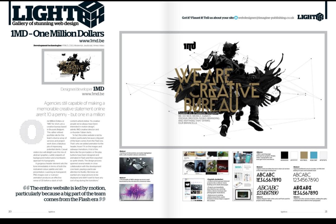
Voici le code utilisé à pour réaliser cette animation, il a consisté a réduire la charge du processeur en animant chaque couche d’image avec du CSS et en animant un système de particules avec canvas.
<header id="header" class="active">
	<div class="wrapper">
		<a id="go-showreel" href="#showreel"><img src="/img/assets/arrow_down.png" alt="arrow down"></a>
	</div>

	<div id="illustration">
		<div id="layers">
			<img id="layer6" class="layer" src="/img/illustration/layer6.png">
			<img id="layer5" class="layer" src="/img/illustration/layer5.png">
			<img id="layer4" class="layer" src="/img/illustration/layer4.png">
			<img id="layer3" class="layer" src="/img/illustration/layer3.png">
			<img id="layer2" class="layer" src="/img/illustration/layer2.png">
			<img id="layer1" class="layer" src="/img/illustration/layer1.png">
		</div>
		<canvas id="dots" width="1612" height="900"></canvas>
	</div>

</header>
#main #header {
  background: #fff;
  overflow: hidden;
  width: 100%;
  position: relative;
}

#main #header #illustration {
  width: 100%;
  height: 100%;
  max-height: 1060px;
  margin: 0 auto;
}

#main #header #illustration #layers {
  height: 100%;
  width: 100%;
  position: relative;
  z-index: 1;
  top: 0;
  left: 0;
  max-width: 1197px;
  margin: 0 auto 20px auto;
}

#main #header #illustration .layer {
  position: absolute;
  width: 100%;
  max-width: 1400px;
  -webkit-will-change: -webkit-transform;
  -moz-will-change: -moz-transform;
  will-change: transform;
}

#main #header #illustration #dots {
  position: relative;
  top: 0;
  z-index: 0;
  margin-bottom: 10px;
}

#main #header.active #layer1 {
  -webkit-animation: layerMove1NoRotate 35s ease-in-out infinite;
  -moz-animation: layerMove1NoRotate 35s ease-in-out infinite;
  -ms-animation: layerMove1NoRotate 35s ease-in-out infinite;
  -o-animation: layerMove1NoRotate 35s ease-in-out infinite;
  animation: layerMove1NoRotate 35s ease-in-out infinite;
}

#main #header.active #layer2 {
  -webkit-animation: layerMove2NoRotate 30s ease-in-out infinite;
  -moz-animation: layerMove2NoRotate 30s ease-in-out infinite;
  -ms-animation: layerMove2NoRotate 30s ease-in-out infinite;
  -o-animation: layerMove2NoRotate 30s ease-in-out infinite;
  -webkit-animation: layerMove2NoRotate 30s ease-in-out infinite;
}

#main #header.active #layer3 {
  -webkit-animation: layerMove3 36s ease-in-out infinite;
  -moz-animation: layerMove3 36s ease-in-out infinite;
  -ms-animation: layerMove3 36s ease-in-out infinite;
  -o-animation: layerMove3 36s ease-in-out infinite;
  animation: layerMove3 36s ease-in-out infinite;
}

#main #header.active #layer4 {
  -webkit-animation: layerMove1 33s ease-in-out infinite;
  -moz-animation: layerMove1 33s ease-in-out infinite;
  -ms-animation: layerMove1 33s ease-in-out infinite;
  -o-animation: layerMove1 33s ease-in-out infinite;
  animation: layerMove1 33s ease-in-out infinite;
}

#main #header.active #layer5 {
  -webkit-animation: layerMove2 34s ease-in-out infinite;
  -moz-animation: layerMove2 34s ease-in-out infinite;
  -ms-animation: layerMove2 34s ease-in-out infinite;
  -o-animation: layerMove2 34s ease-in-out infinite;
  animation: layerMove2 34s ease-in-out infinite;
}

#main #header.active #layer6 {
  -webkit-animation: layerMove3 35s ease-in-out infinite;
  -moz-animation: layerMove3 35s ease-in-out infinite;
  -ms-animation: layerMove3 35s ease-in-out infinite;
  -o-animation: layerMove3 35s ease-in-out infinite;
  animation: layerMove3 35s ease-in-out infinite;
}

#main #header #picture {
  display: block;
  width: 100%;
  max-width: 1317px;
  margin: 0 auto;
  position: relative;
}

#main #header .wrapper {
  width: 100%;
  max-width: 1680px;
  margin: 0 auto;
  position: relative;
}